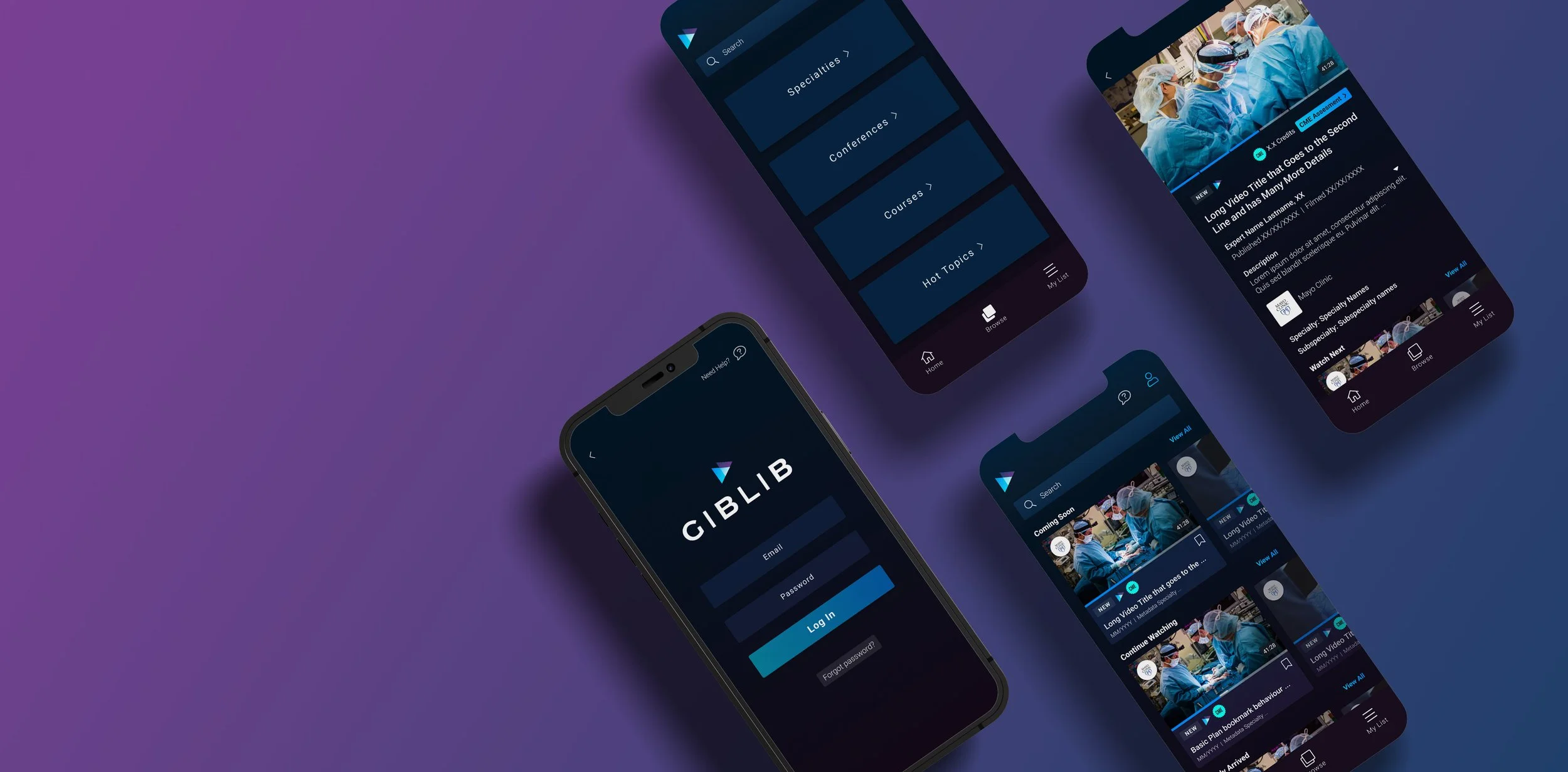
PROJECT: Giblib Mobile App
DURATION: 5 Months
ROLE: UX & UI Design
Project Vision
Giblib's platform provides medical professionals with continuing medical education (CME) through high-quality videos created in partnership with top medical institutions and professionals. We worked on creating a mobile app to make the platform more convenient for users and drive business performance. The app's main goal for phase one launch was to provide IOS users access to search and browse through all the platform's video content, view videos, manage bookmarks, and access CME.
Research Insights
The product team analyzed information provided by in-house medical professionals, user interviews, and feedback received through the web platform to holistically understand user motivations, preferred operating system, and goals in developing the mobile app. We recognized user personas, and the primary user are internal medicine doctors who work at the ER at a large hospital. A secondary cohort are nurse practitioners who work at a small clinic. We discovered the main features desired and prioritized these based on our tight timeline.
Meet the users
Dr. Patel Jitendra, MD
Age: 51
Education: American Board of Internal Medicine
Hometown: Mumbi, India
Family: Married, 2 Kids
Occupation: MD, Internal Medicine
Dr. Patel Jitendra, MD is an Internal Medicine Specialist affiliated with Chesapeake Regional Medical Center and Sentara Hospital medical facilities. To gain his CME credits, he usually attends conferences. But, with two daughters and his busy schedule, he has difficulty finding time to participate in onsite conferences, so he is looking for more flexible ways to gain his CMEs.
Lydia M. James, MSN, FNP-C
Age: 38
Education: Master of Science in Nursing with a Family Nurse Practitioner
Hometown: Wisconsin, U.S.A.
Family: Single
Occupation: Family Nurse Practitioner
Lydia is a busy nurse practitioner at a small family practice. She used to attend conferences, but to do so, she had to use her private time off, which hindered her ability to travel. To earn her CME, Lydia finds online resources to meet her requirements but finds most platforms frustrating to use.
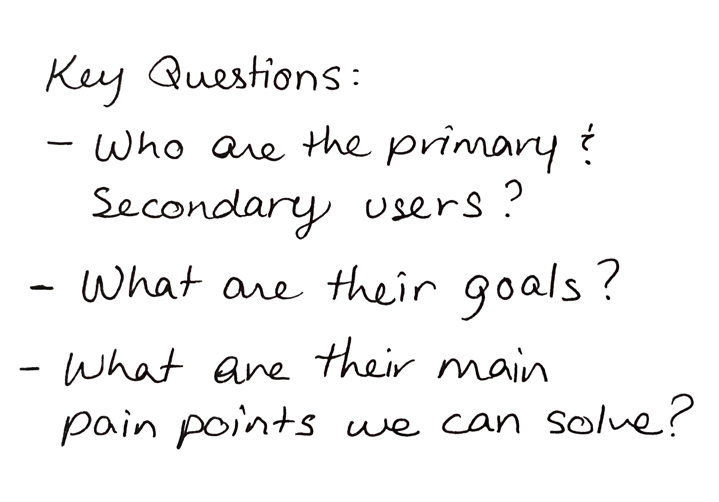
Pain Points Identified
Attending onsite CME lectures is a hassle for users.
1.
Users wished they could earn CMEs from any place, any time
2.
Users don't always have a computer to access websites, and mobile sites are clunky.
3.
Information Architecture
Honed in on the app's navigation and content strategy by creating a site map.
Ideation
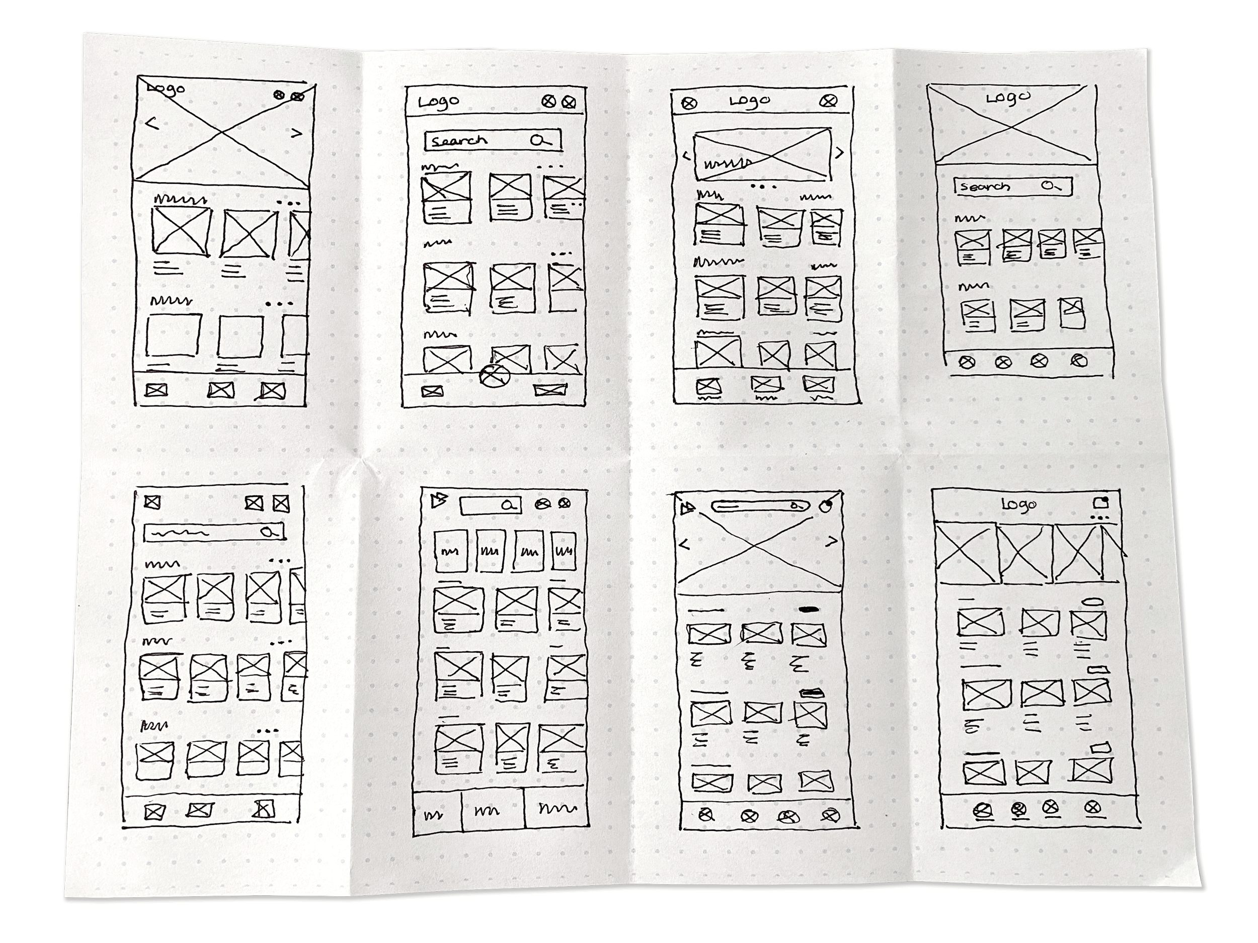
Paper wireframes
Used the crazy eights ideation method to brainstorm possible solutions, ensuring all information the app and website would provide is easy for the user to find and does not cause cognitive overload.
Digital wireframes
Used the crazy eights ideation method to brainstorm possible solutions, ensuring all information the app and website would provide is easy for the user to find and does not cause cognitive overload.
Testing the idea
Created LoFi prototypes for two of the preferred wireframes to conduct usability studies to refine the platform's user experience. The following were a few of the most critical pieces found:
Users thought the back buttons were hard to press throughout the platform, leading to an increased touch area of buttons.
Bottom navigation buttons competed with IOS's home bar, ushering the implementation of Apple's Human Interface guidelines throughout the app.
Users had a hard time keeping up with the status of CME videos, guiding us to implementing CME status graphics.
The solution
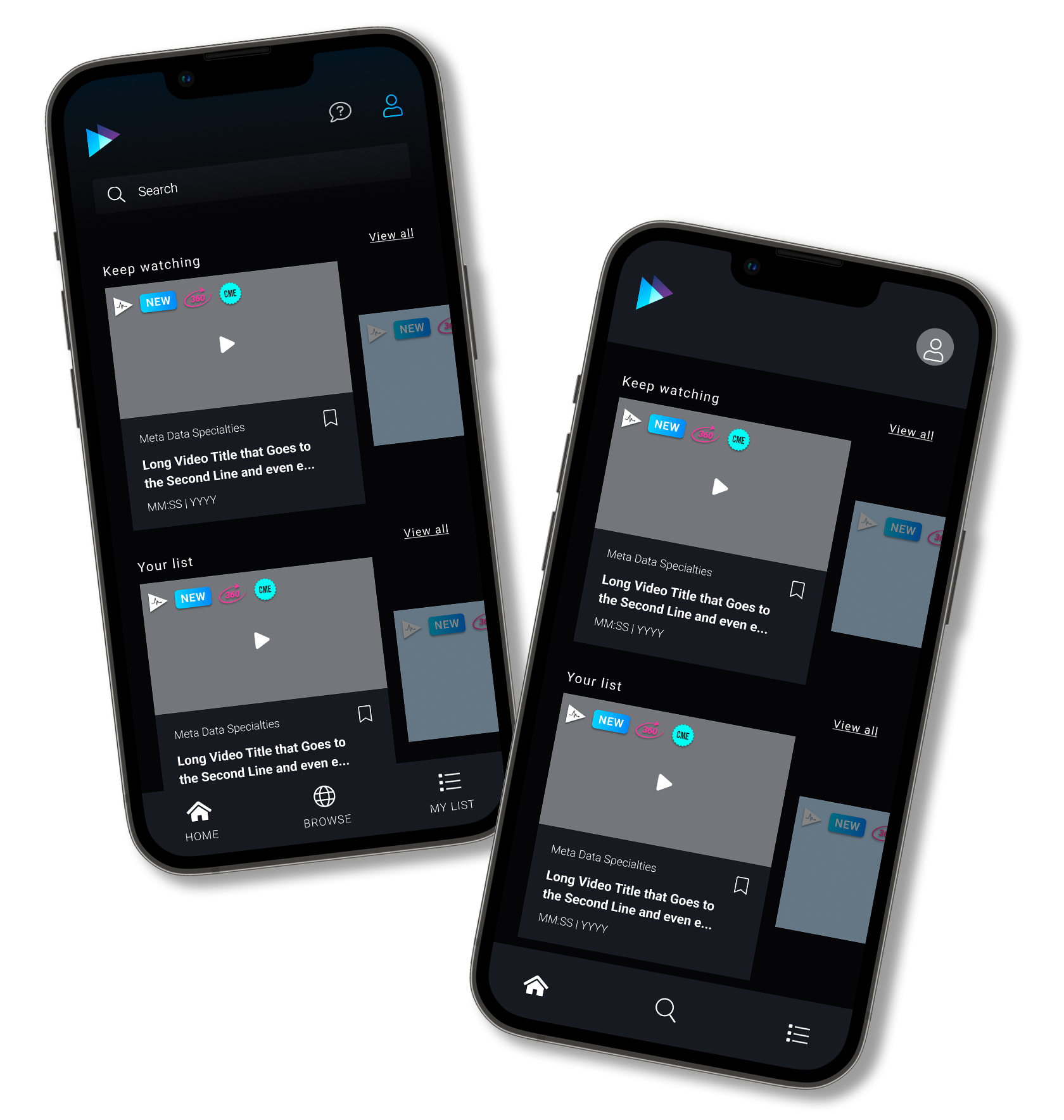
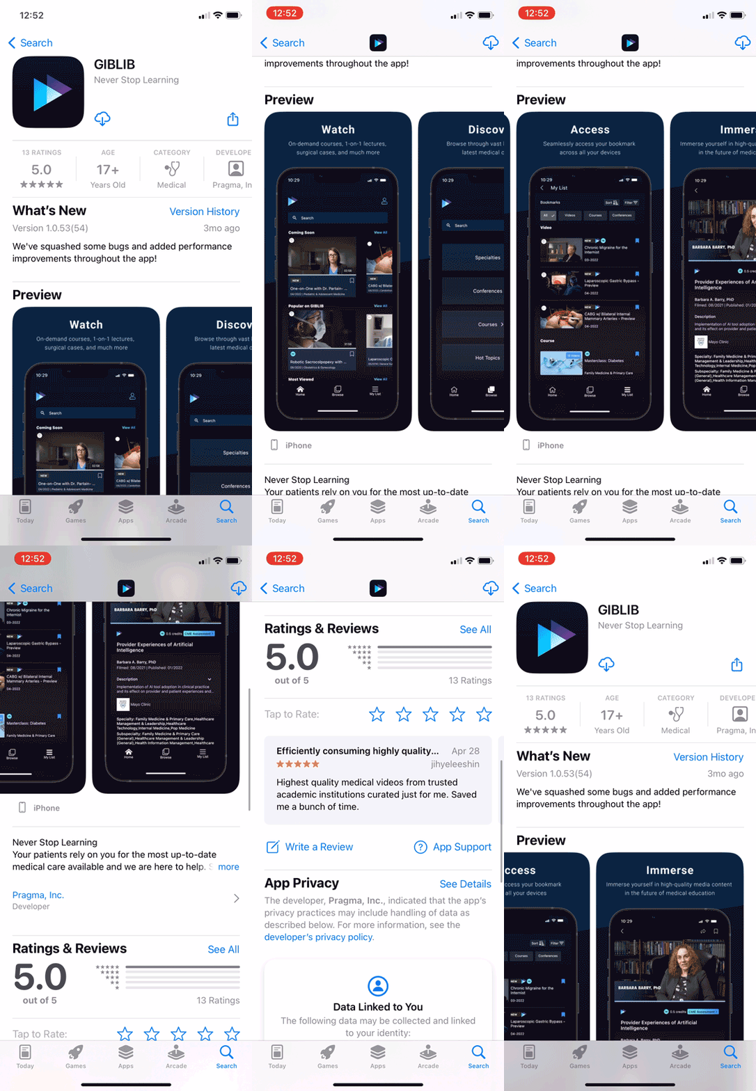
Giblib's mobile app provides a simple video streaming platform that allows users to search, browse and view videos. The platform's design makes the product stand out against the competition by continuing its use of dark mode patterns. The application provides at-a-glance features that make completing CMEs a breeze by providing users with video and assessment status.
Design System
Giblib's brand uses a dark mode design schema with purples and blues, differentiating the platform from its competition and providing the user with a more modern viewing experience. Working directly with Giblib's Art Director, I created the design system and components library for the mobile app to provide users with a consistent experience throughout the platform.
Take away
The most significant learning experience was working in a large team and receiving feedback early in the design process. Primarily working with developers early in the design process provided invaluable feedback that helped maintain our fast-paced timeline. In the future, I would like to see the app evolve with phase two features such as offline viewing, a CME-specific page, and in-app assessment implementation.


