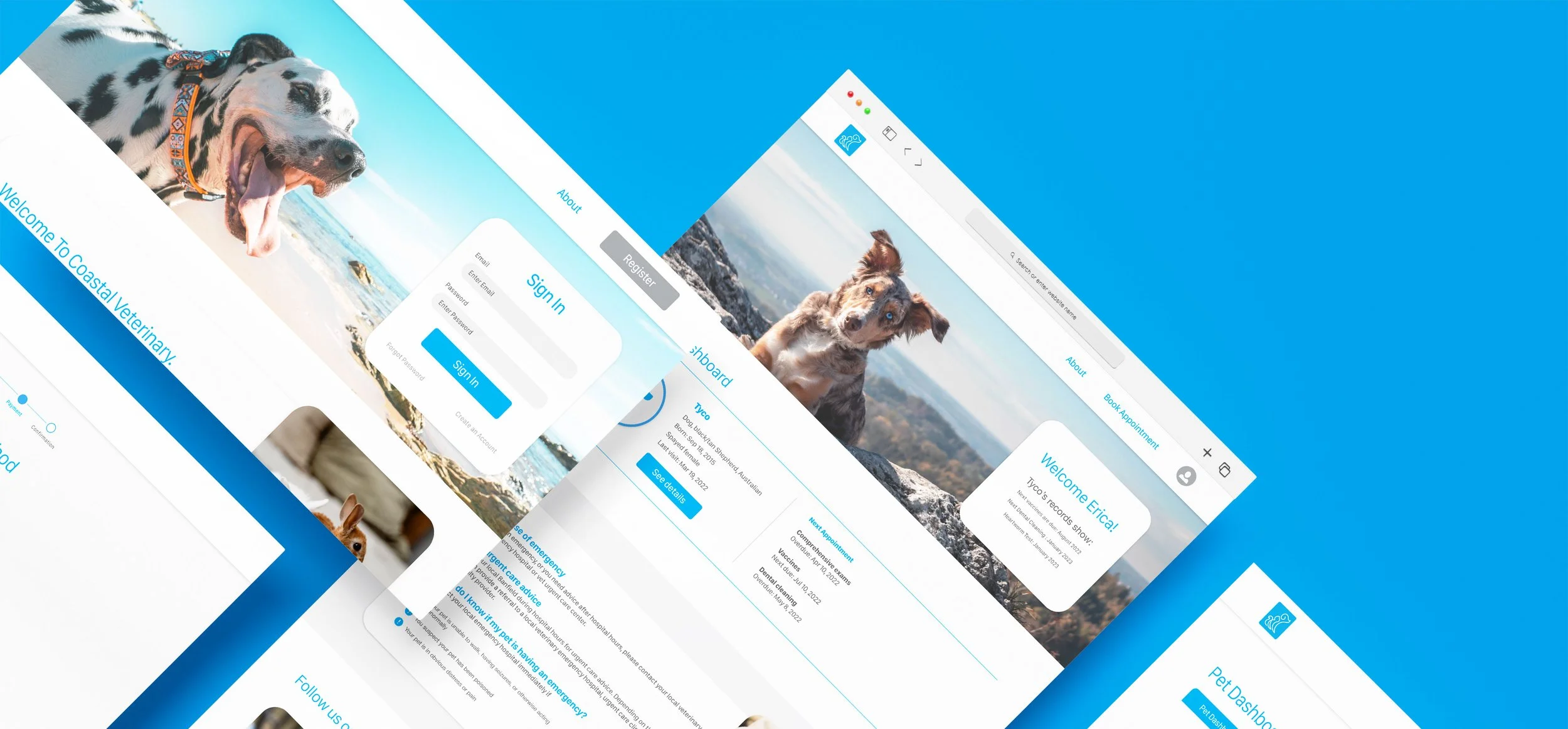
PROJECT: Coastal Veterinary
DURATION: 1 Month
ROLE: Concept, Research, Visuals
Project Vision
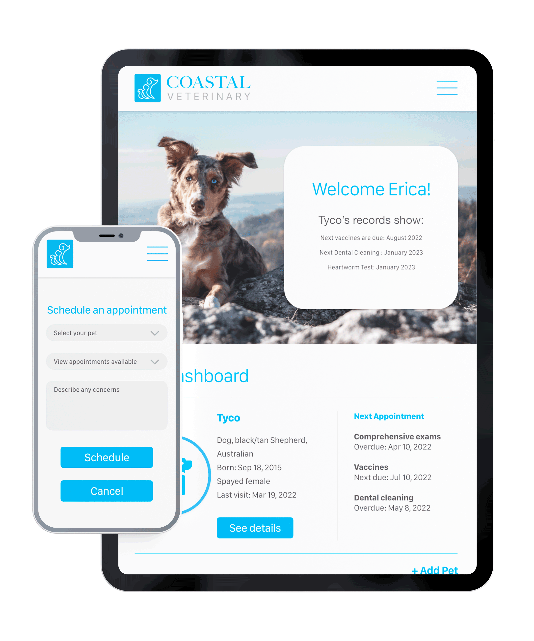
Coastal veterinary is reimagining the pet care experience by delivering a modern facility with an exceptional team of medical experts. Coastal offers a membership program to help pet owners plan their pet's healthcare and would like to provide members with a responsive online experience. This website experience allows members to check on their membership plans and payments. Also, it will enable pet owners to review their pet's records, view upcoming health care needs, and schedule appointments.
Research Insights
Conducted interviews with pet owners to create user personas and empathy maps and understand the user's needs. A primary user group identified through research was working adults who worked odd hours and had difficulty scheduling appointments during office hours. Another influential group are adults with multiple pets who had trouble managing pet vaccinations and keeping up with healthcare appointments.
Meet the users
Aaron
Age: 33
Education: IT Certifications
Hometown: São Paulo, Brazil
Family: Married
Occupation: Data Entry Specialist
Aaron works at a communications company and has two cats, Tink and Tory. He and his wife have a hard time communicating with phones over the phone since English is their second language. They would love a veterinary office that provides online services to avoid calls as much as possible.
Roxanne
Age: 42
Education: Bachelor's Degree in Nursing
Hometown: Chesapeake, VA
Family: Single
Occupation: ER Nurse
Christine has a dog, Roxy. Due to her work schedule, she has difficulty registering her pets with a vet. She works odd hours at a busy hospital, and she is looking for a veterinary office where she can access Roxy's records and can schedule appointments online
Pain Points Identified
Scheduling appointments during office hours over the phone can be difficult for some due to language barriers or office hours.
1.
Keeping track of multiple pets' health appointments and vaccination schedules can be difficult.
2.
Keeping health records for pets has shown to be a bit challenging since some pet owners often lose them.
3.
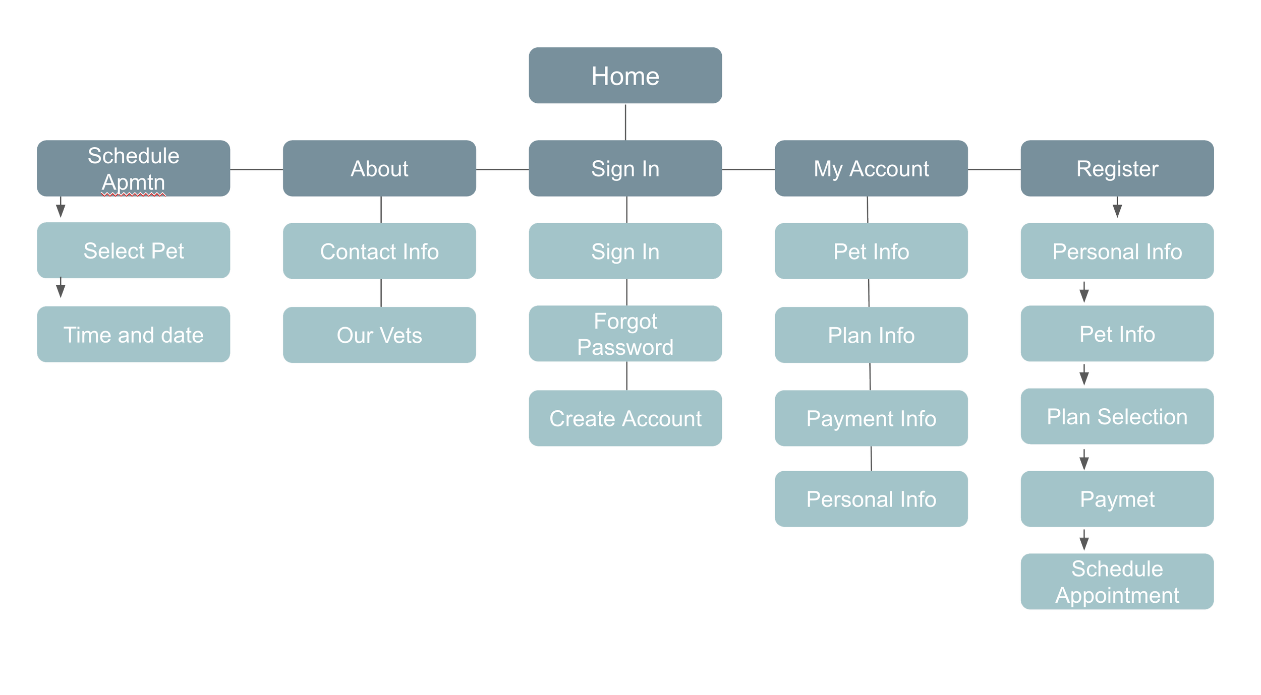
Created an organizational structure for the website to ensure the website would have optimal information hierarchy and easy navigation for the user.
Information Architecture
Ideation
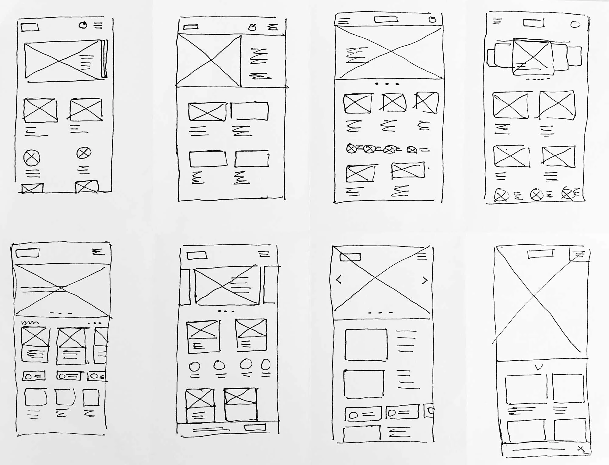
Paper wireframes
Used the crazy eights ideation method to brainstorm possible solutions, ensuring the users can quickly find the information they need with easy navigation.
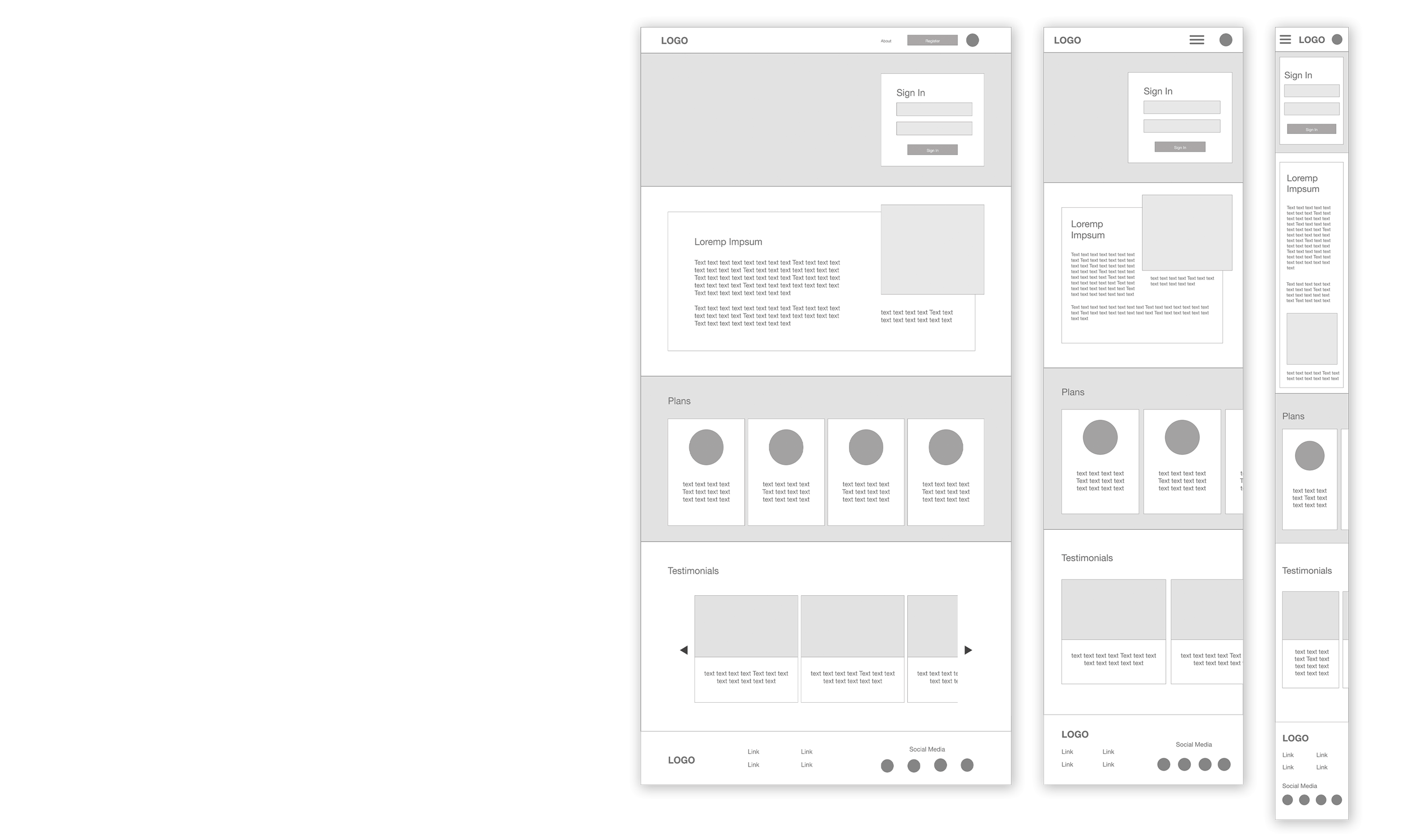
Digital wireframes
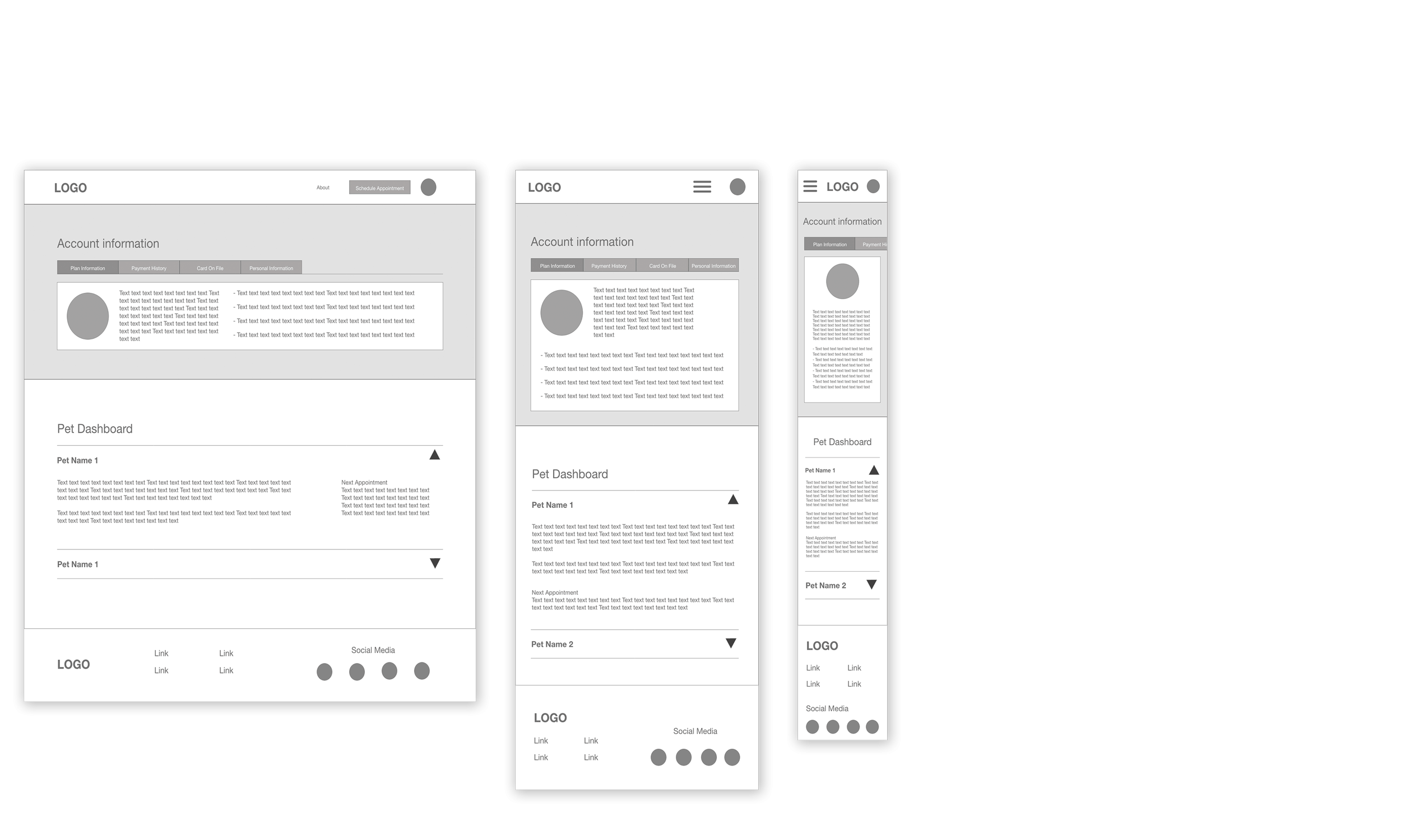
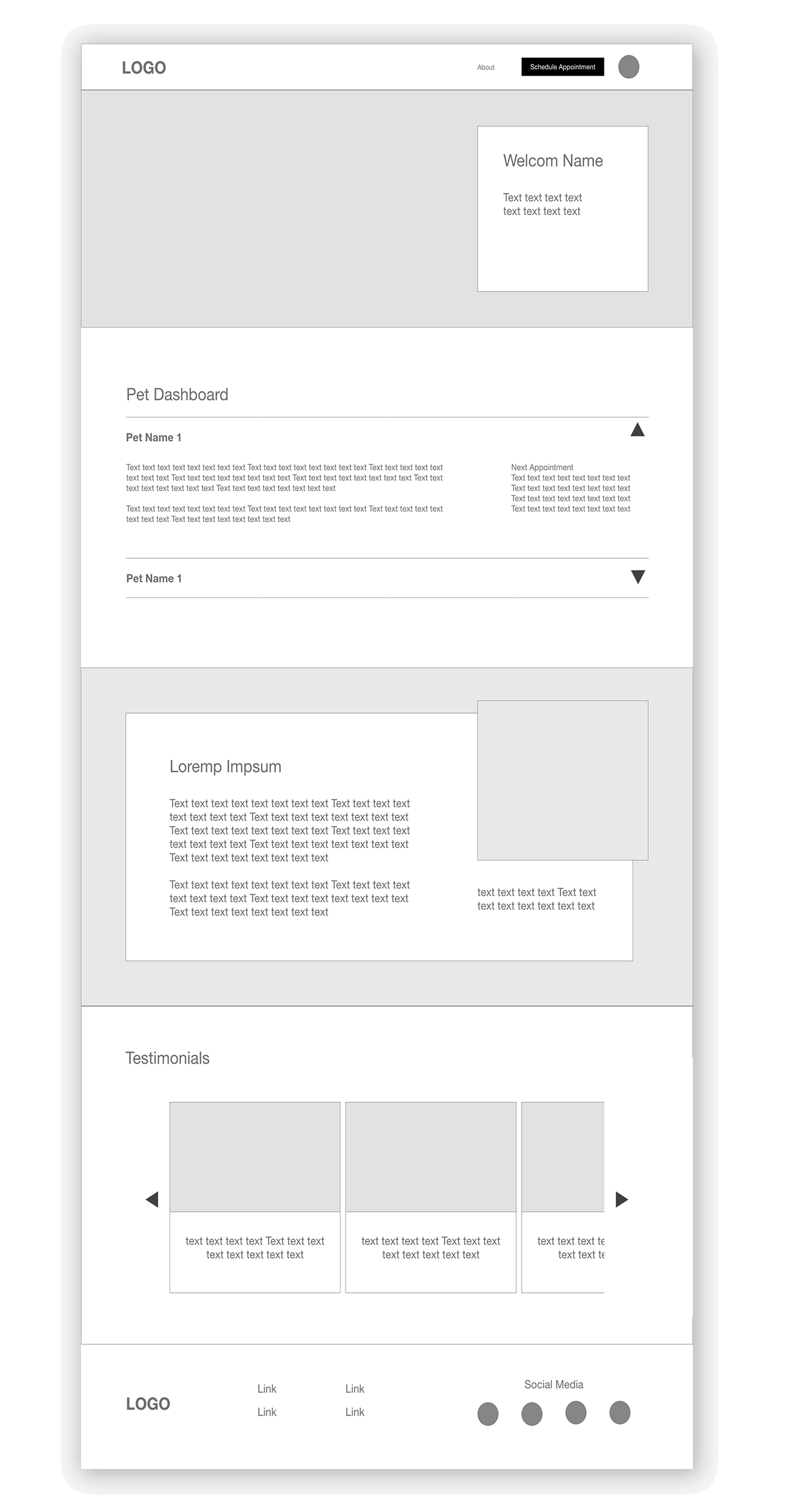
Created wireframes for various screen sizes, ensuring the information on the pages provided the users with their most relevant information. Realizing that new visitors looking for information about the clinic would have different needs than users who already have an account.
Logged-in users will have access to their profile, which includes a pet dashboard and other important information.
Testing the idea
I observed various themes that would improve the platform's user experience by conducting a usability study. The following were a few of the most critical insights found:
Relevant pet information should be present for logged-in users right on the homepage.
Most users ignored the schedule appointment button because it looked similar to the registration button.
Emergency contact information is essential to have in a rapidly accessible area.
The solution
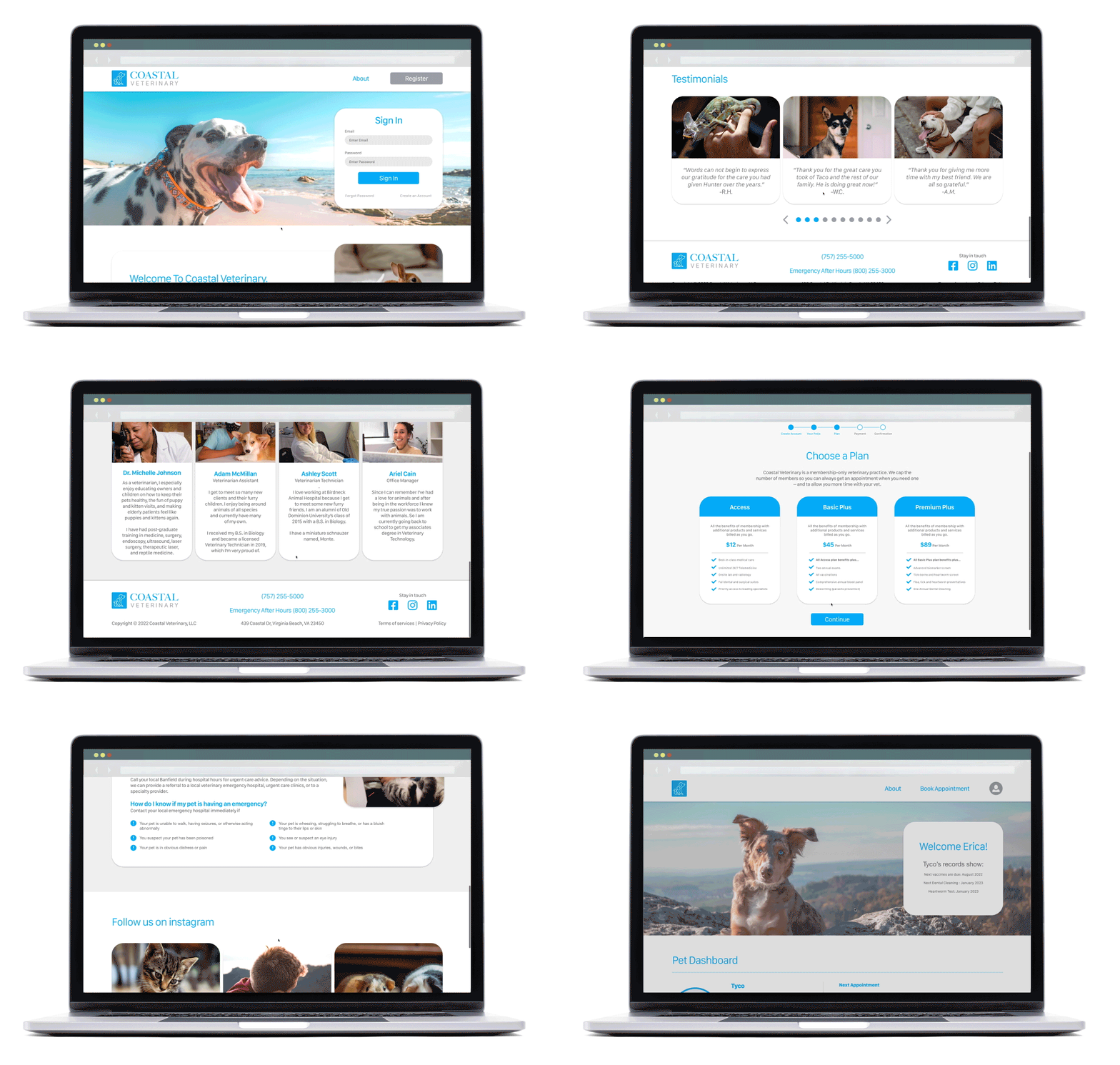
Coastal Veterinary website's main user flow focuses on providing new users with the information they need to sign up and making that process as simple as possible. In contrast, account holders receive the most applicable information about their pet's healthcare.
Design System
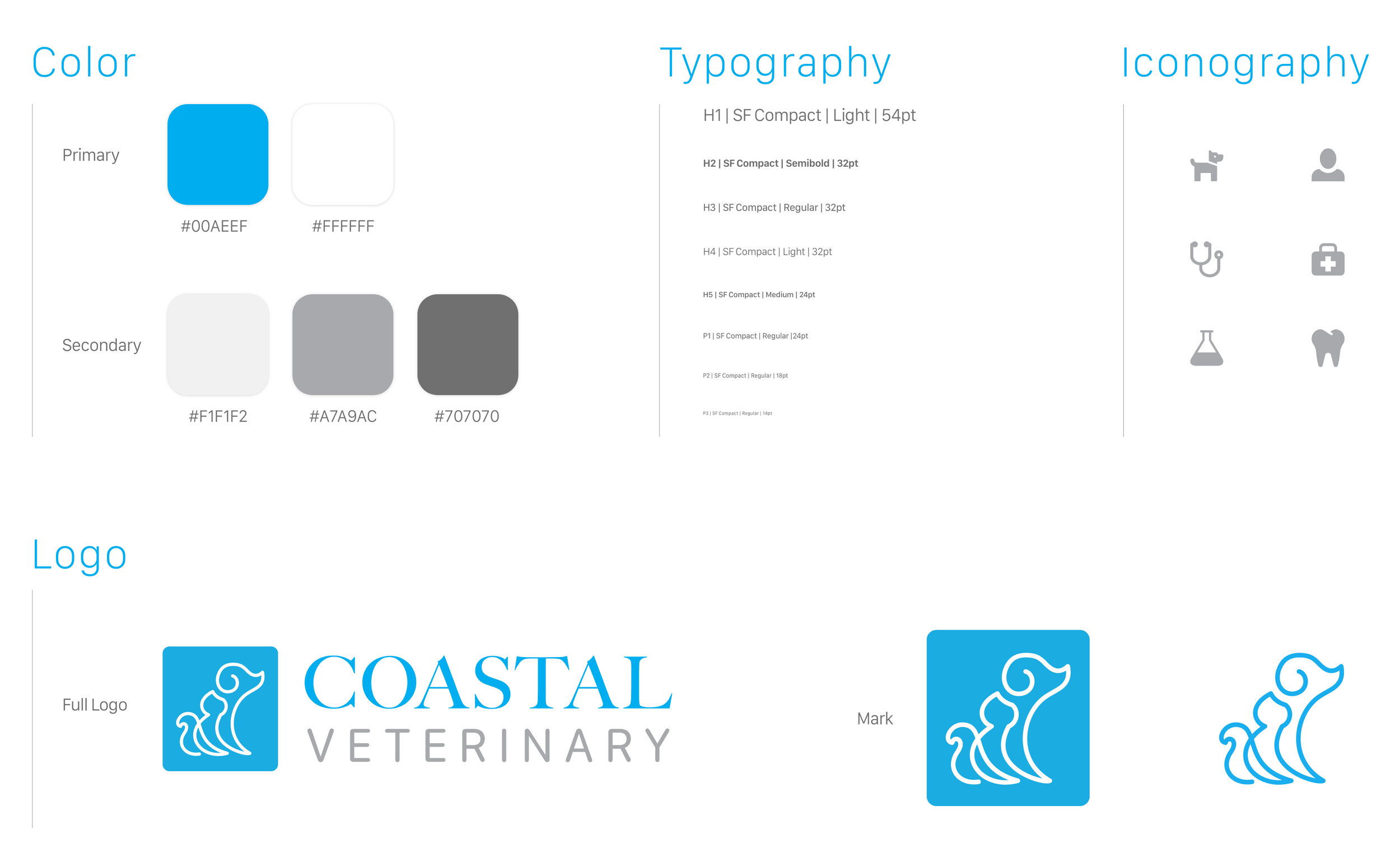
The Coastal brand uses a bright blue and white color pallet and energetic imagery of pets to give the site a lighting and airy modern feeling. The site uses the font family SF Compact for its clean lines and versatile font family.
Take away
As a pet owner, I learned to look at interview participants with a very different lifestyle than my own to know about others' needs and set aside my viewpoints and biases. This practice gave me insights that helped me improve the platform's usability. Along with more testing and iterations, adding more interactions to all the features and even micro-interactions to the site would be a great way to improve the site's experience. Another area to explore in the future is the clinic's internal experience and how employees manage their day-to-day work and data entry.


