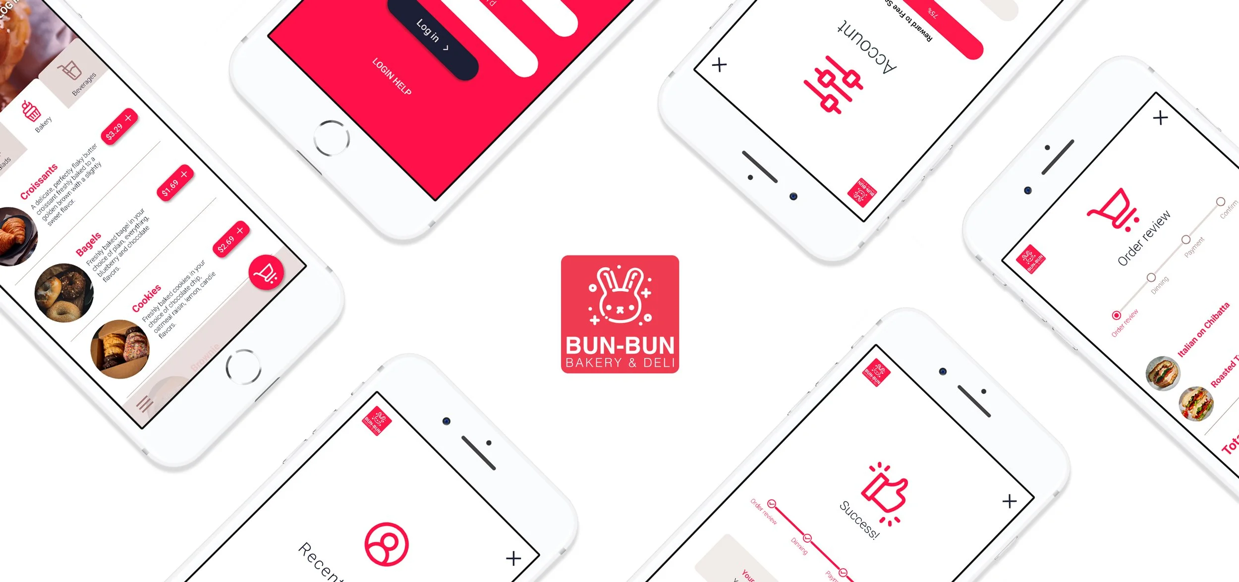
PROJECT: Bun-Bun Mobile App
DURATION: 2 Months
ROLE: Concept, Research, Visuals
Project Vision
The Bun-Bun Deli is a popular restaurant offering delicious meals for breakfast, lunch, and dinner in a quirky, fun-loving environment. To add to the deli's success, we developed an easy-to-use app that allows users to browse the deli's menu and place orders for pick-up or delivery. The app will enable patrons to have a more streamlined process to enjoy Bun-Bun's delicious food wherever they are.
Research Insights
Conducted interviews to create user personas and empathy maps and understand the user's needs. A primary user group identified through research was working adults who don't have time to cook meals. This user group confirmed initial assumptions about Bun-Bun Deli's customers, but the analysis also revealed that time was not the only factor limiting users from cooking at home. Another group identified included users ordering lunch for an entire team of coworkers.
Meet the users
Miguel
Age: 24
Hometown: San Juan, PR
Family: Married
Occupation: Contractor
Miguel is a hard-working non-English speaking contractor who needs to pick up takeout for him and his wife to have a relaxing home date with his wife after a long day.
Roxanne
Age: 32
Education: Bachelor’s Degree
Hometown: Newark, NJ
Family: Single
Occupation: Marketing Writer
Roxanne is a marketing writer who works chaotic shifts to meet the marketing demands of her firm. She orders food for lunch a few times a week so she can work during lunch. She sometimes places orders for her teammates so they can all focus on work.
Pain Points Identified
Menus can be very complicated and hard to navigate.
1.
Users are wiry of long payment and ordering processes.
2.
It's hard to tell if an order is ready for
pick-up.
3.
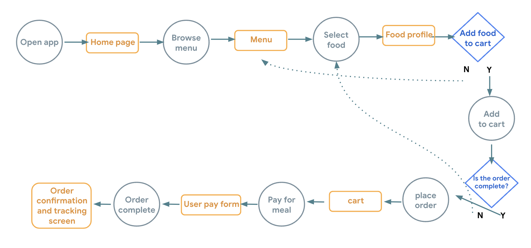
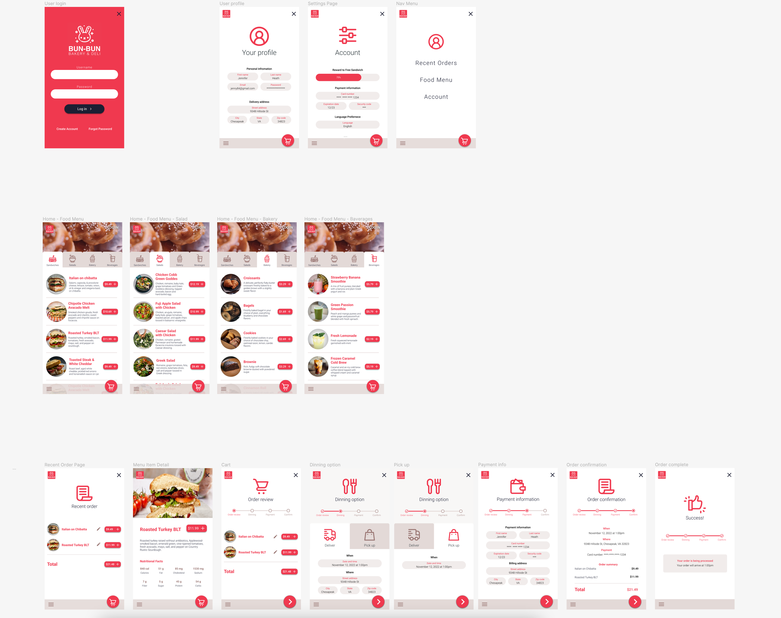
Mapping the user flow helped me understand all the moments the user will have to make a decision and helped me simplify any areas I could identify as possible areas of friction.
The User Flow
Honing in on the right solution
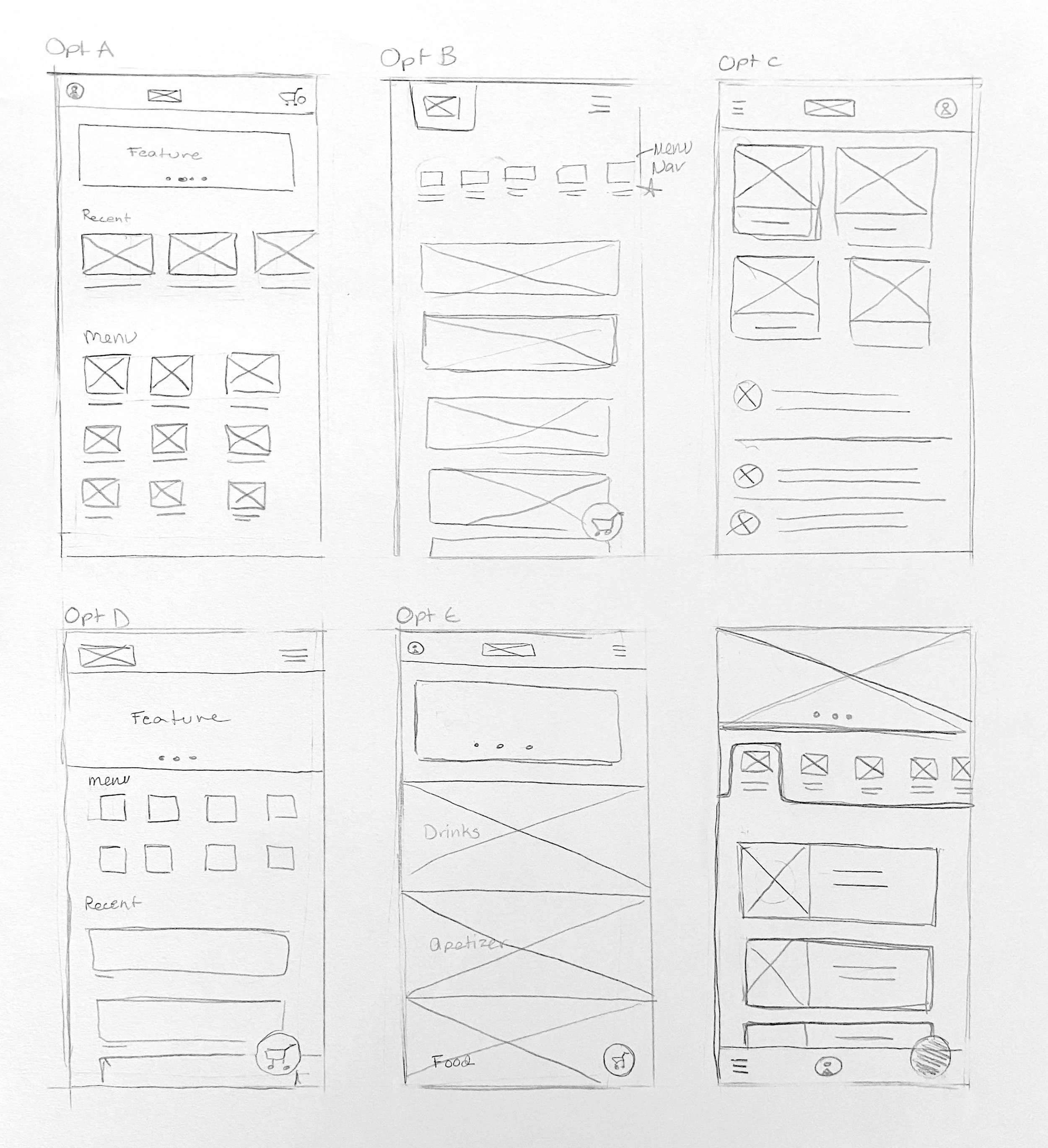
Paper wireframes
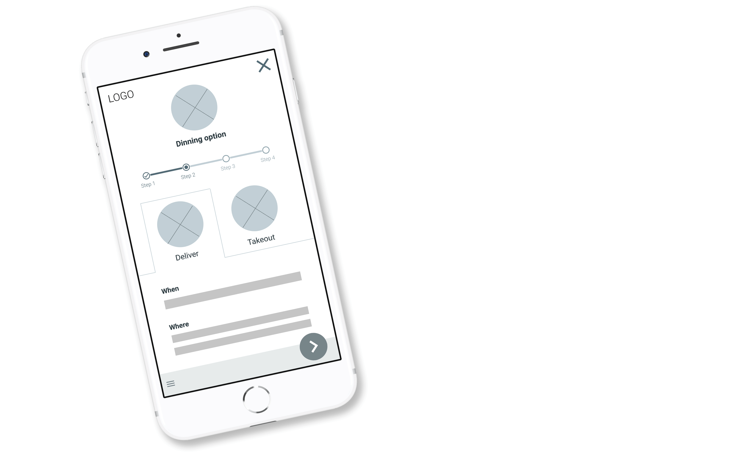
Drafting different screen ideas of the app on paper helped me explore possible solutions quickly. I prioritized a quick and easy menu organization to help users save time.
Digital wireframes
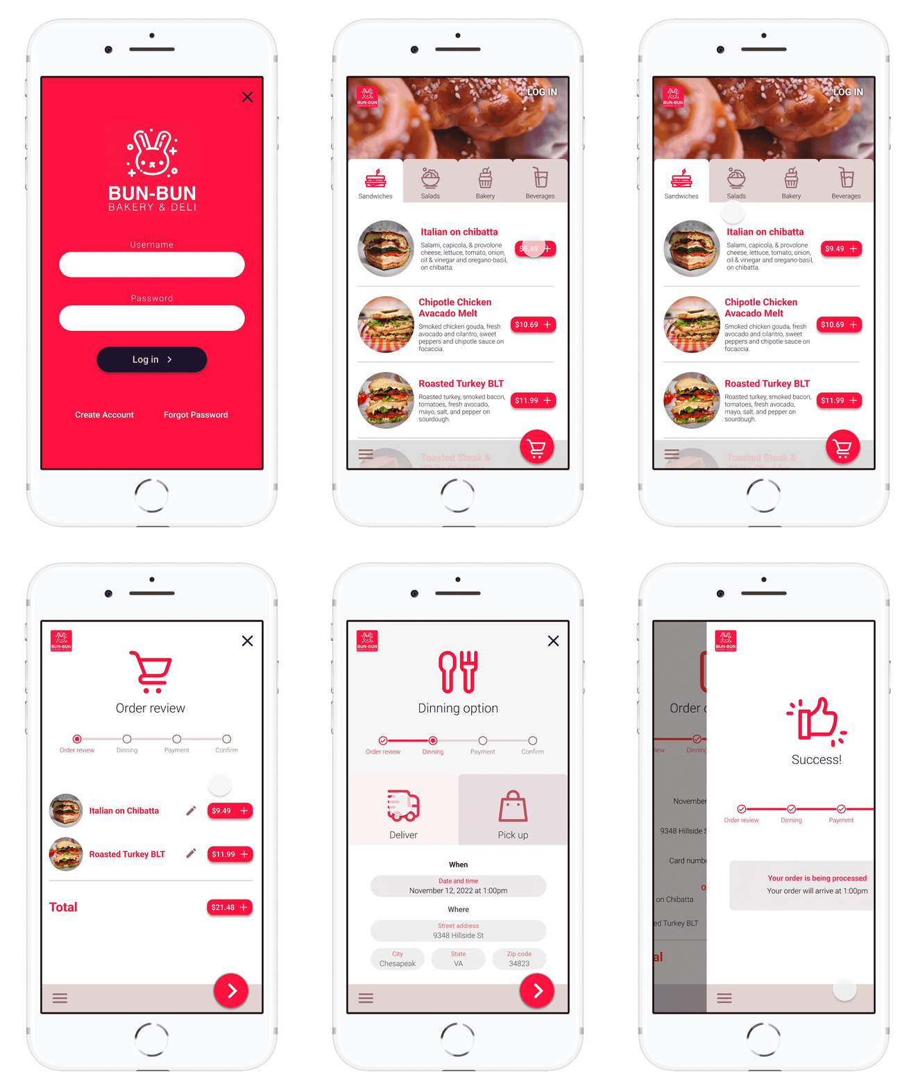
Homescreen menu tabs allow users to quickly find items to purchase and see details before adding them to their cart. While letting the user know the section of the menu they are currently looking at.
I created a progress bar for the ordering so the user can anticipate the following steps and has a clearly defined end goal insight.
The solution
Bun-Bun Mobile App's main user flow focuses on getting the users from the menu to completing an order as quickly as possible. The order placement screens provide indications along the way to help set user expectations.
Design System
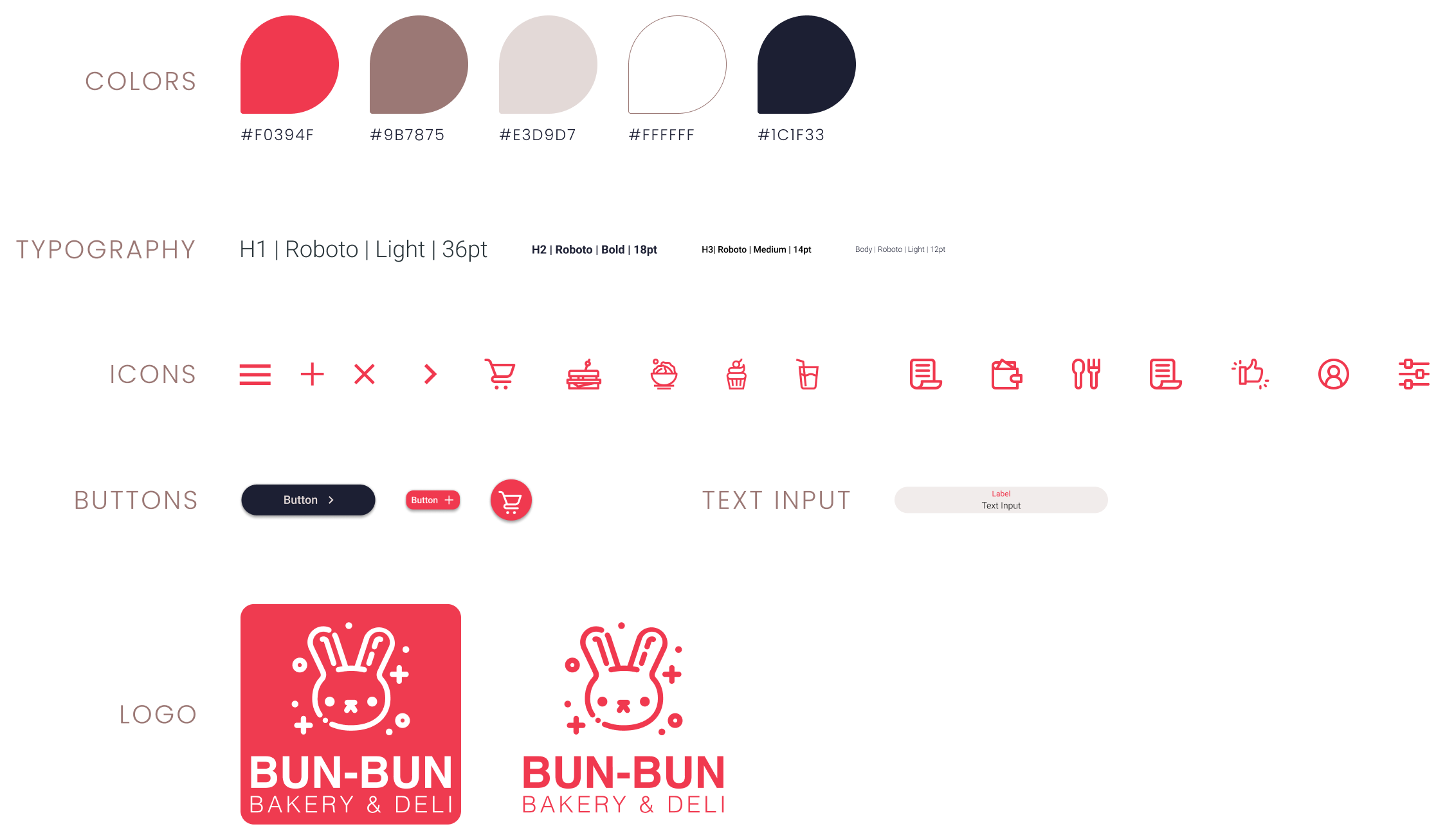
Utilizing a vibrant red paired with warm tan and brown colors felt like the perfect fit for Bun-Bun's branding. The red helps evoke the lively and quirky style of the restaurant, paired with the warm tan and brown, conjuring freshly baked bread, creating a nice balance between colors. The primary typeface of choice for the app is Roboto. I felt this typeface best fit the app due to its versatility and modern appeal.
Take away
Being an enthusiast of eating at local delis, working on Bun-Bun's App was incredibly rewarding. I learned about many of Figma's new features and honed in on the design process as a whole. Although there are many features and interactions I could not flesh out due to the project's short time, it's not to say I will not incorporate them in future projects.


