PROJECT: GovInsight App + Website
DURATION: 2 Months
ROLE: Concept, Research, Visuals
Project Vision
GovInsight is a digital platform that is a one-stop resource aimed at helping people participate in elections by providing a complete view of every government branch's inner workings and resources for becoming an active voter. The application and website must offer a seamless experience regardless of the user's chosen platform. And organize the slew of information and resources needed to make informed electoral decisions.
Research Insights
To understand any market gaps and user needs the GovInsght platform should fulfill, I conducted interviews and a competitive audit to learn about possible gaps in the market and how the platform should assist its users. A primary user group identified is the first-time voter looking for information to make voting decisions. Another interesting cohort are users who are new to the U.S. and must stay informed of any policies that might change their living situation or community.
Meet the users
Minerva
Age: 36
Education: High School
Hometown: Sinaloa, MX
Family: Single Mother, 2 Kids
Occupation: Property Manager
Minerva is a first-generation MX immigrant living in the states for 10+ years. She is a single mother and works hard to provide for her family, so she is always on the go and only has access to a mobile phone. She recently became a U.S. citizen and wants to learn more about participating in elections to give her kids the best opportunities.
Ibraham
Age: 21
Education: College Student
Hometown: Jaipur, India
Family: Single
Occupation: Student Employee
Ibraham came to the U.S. on a student visa to study A.I. Technology and works as a student employee for the university he attends. He is working hard on his degree and hopes to get a master's to work with top tech companies. He tries to keep up with any political developments that might affect his fellowship but finds it challenging to balance everything in his life.
Pain Points Identified
Making an informed decision on elections is ever more complicated and time-consuming due to misinformation.
1.
Keeping track of policies that affect the user and their community is tedious.
2.
Users have difficulty knowing about their electoral district and what will be on the ballot ahead of elections.
3.
Information Architecture
Planned the navigation and content strategy for the mobile app and website by creating a sitemap for each.
Ideation
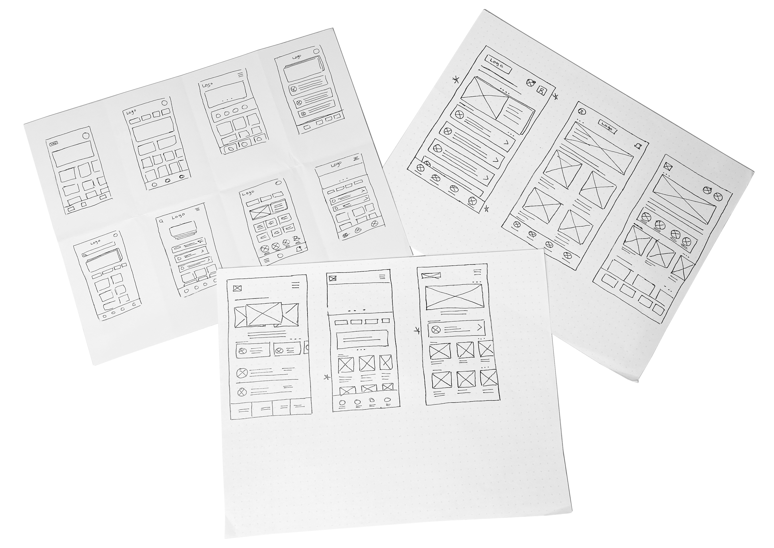
Paper wireframes
Used the crazy eights ideation method to brainstorm possible solutions, ensuring all information the app and website would provide is easy for the user to find and does not cause cognitive overload.
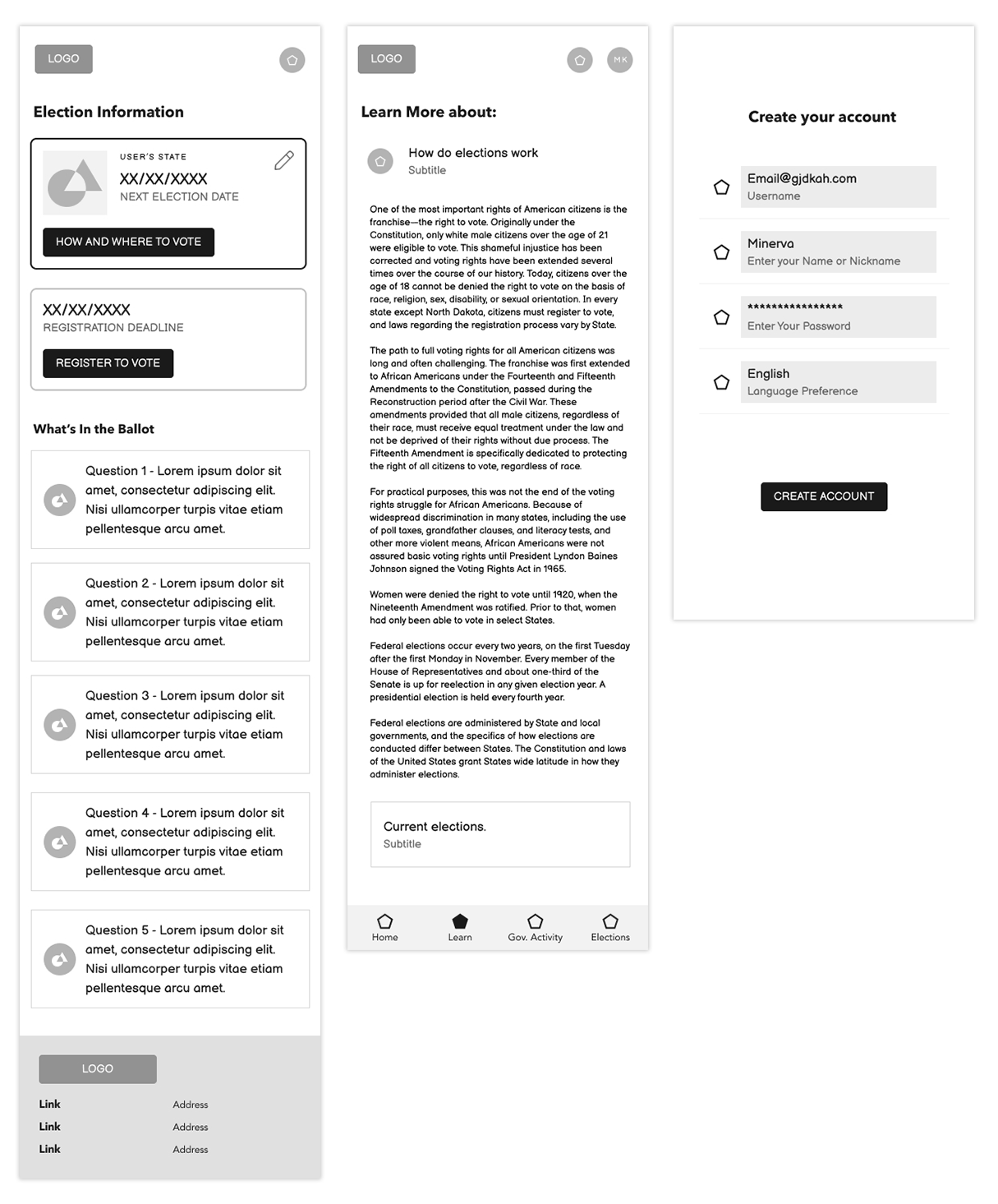
Digital wireframes
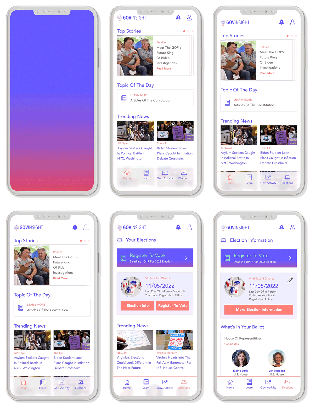
Created digital wireframes for the app, honing on the organization for each resource the app provides the user. Worked through user flows to ensure the app will be intuitive to navigate.
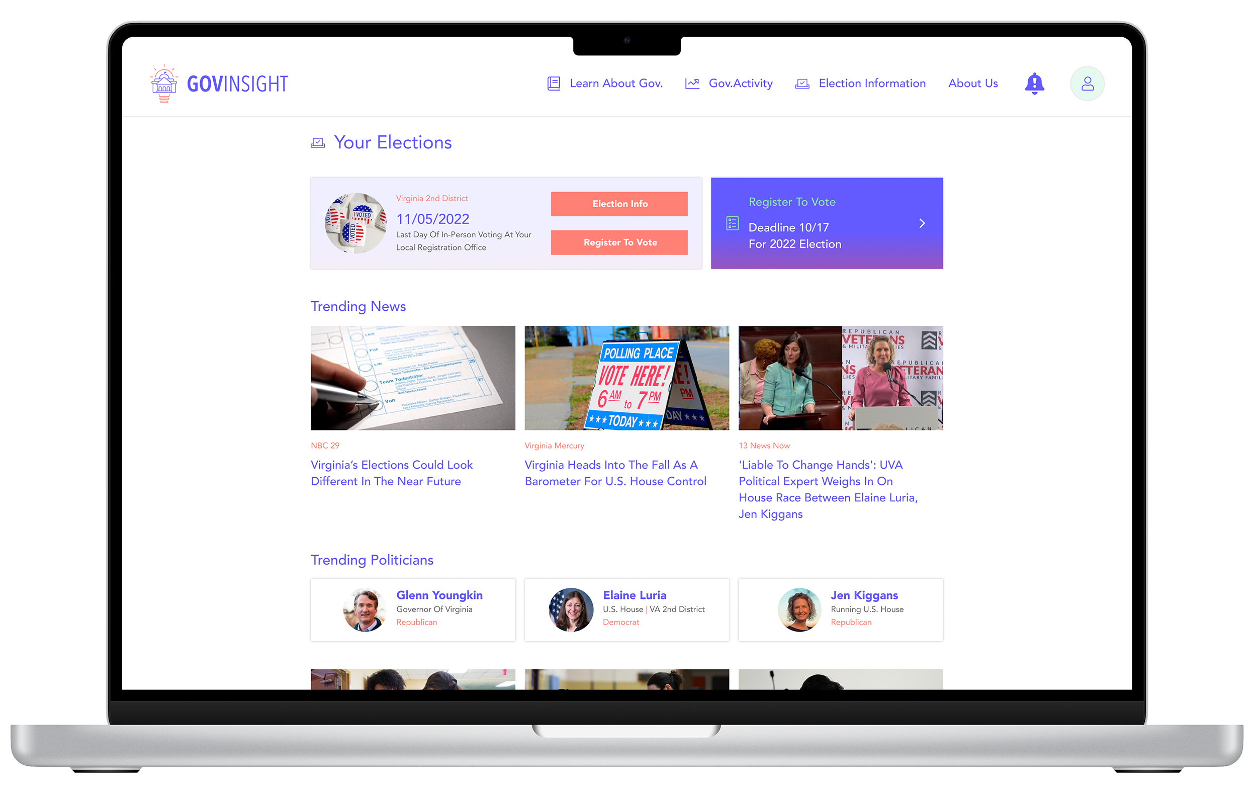
For the responsive website, I created the wireframes for various screen sizes, updated the navigation, and added features that would make sense and add value to the platform at different screen sizes.
Testing the idea
I used a LoFi prototype to conduct a usability study to improve the platform's user experience. The following were a few of the most critical pieces found:
3 out of 5 users thought they should be able to edit their district from the elections page and their profile.
2 out of 5 users thought they could learn about current elections from the Learn menu.
A user who does not speak English wished for additional language options.
The solution
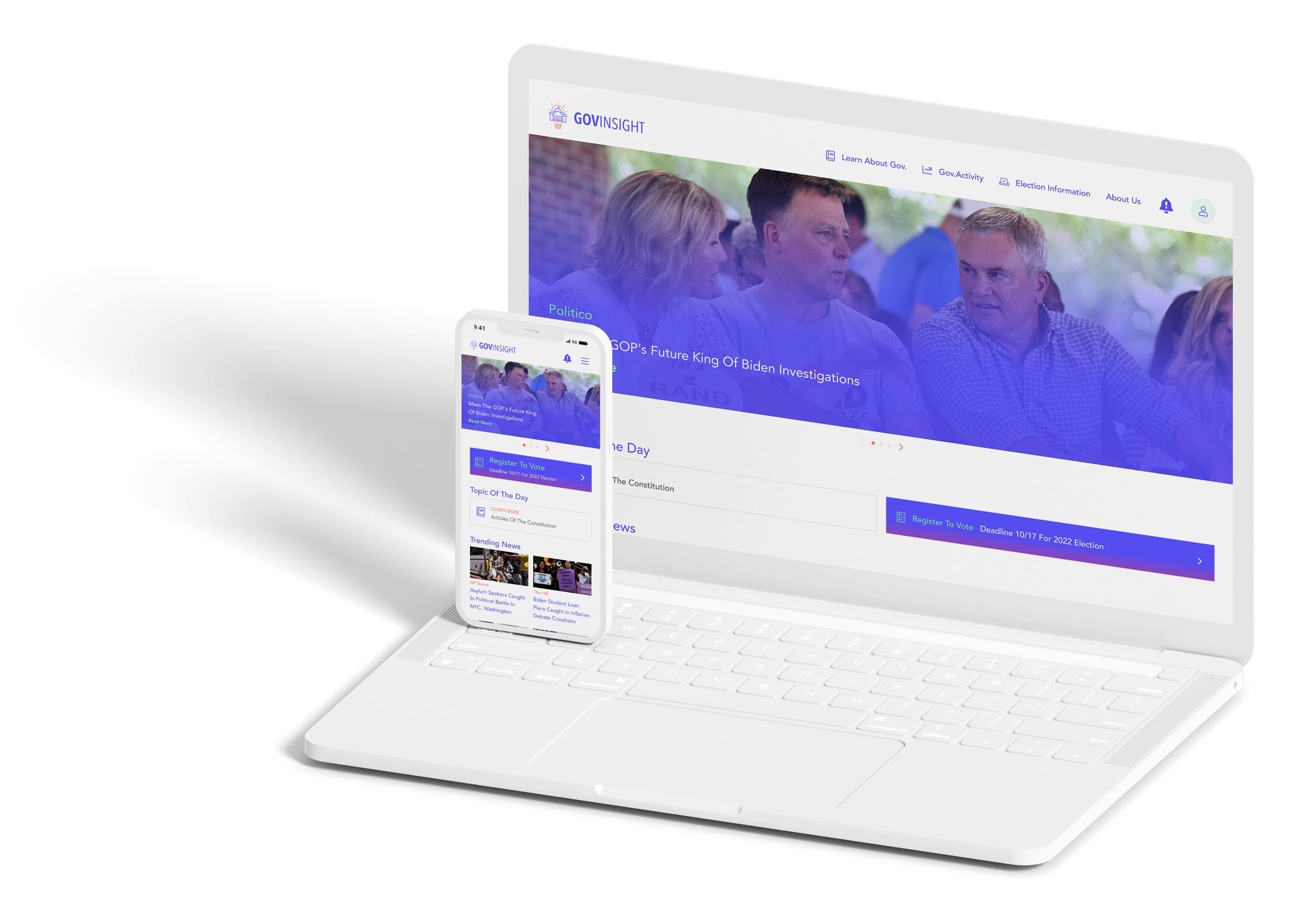
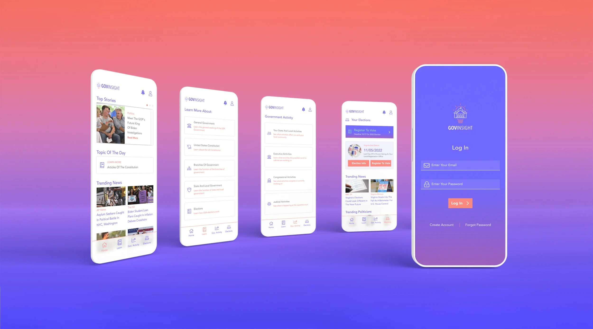
GovInsight app and website's main user flow focuses on providing users with all the information needed to become knowledgeable community members.
It offers:
Learning resources on how the U.S. government works
Follows government activities by the branch of government and the user's community
Provides relevant election news and resources to learn how to participate
Design System
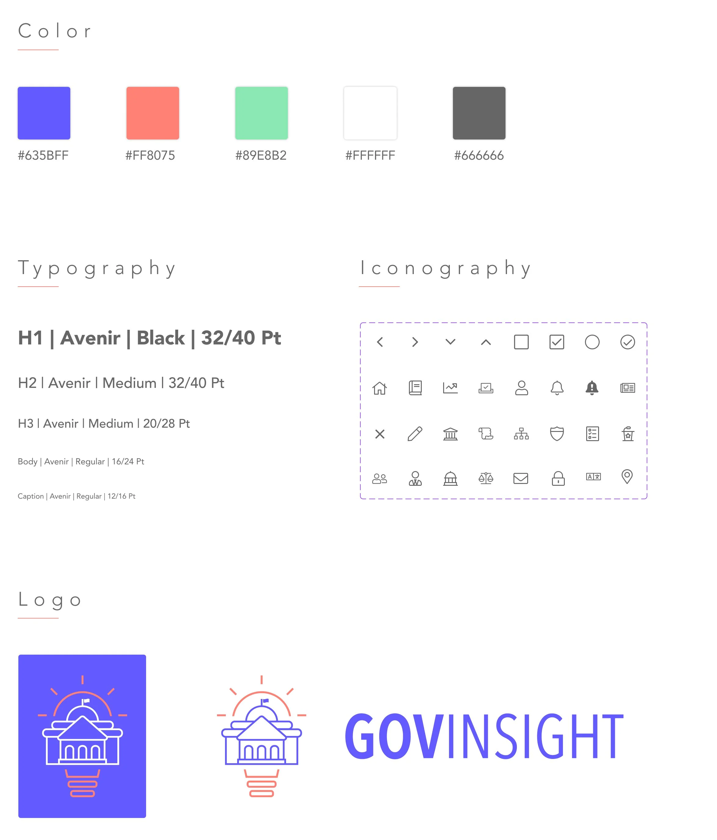
GovInsight's brand is bright and modern, using white, pink, and purple as their primary color to symbolize the platform's mission of maintaining independence from political influences. The logo represents knowledge and a path to participating more in the operation of our country's government. I chose the font family Avenir due to its versatility, readability, and clean lines that paired well with the logo's clean lines.
Take away
After reading in the news that fewer than half of Americans can’t name all three branches of government, I realized there could be a way to fix this issue by providing a platform to help Americans and incoming residents learn more about government. In the future, I would like to see this platform improve its user experience by keeping the user's within the forum while they read third-party articles. To maintain user engagement by creating an environment that carefully balances the subject matter's seriousness with gamification that provides a fun and rewarding incentives.


